
AI first layout
AI first is one of the two layouts of the Form Builder. It is the same builder — the same form model, the same settings, the same save, publish and undo — composed around the chat instead of around the element tree.
In the standard layout you edit the form by hand and the assistant is one more panel. In AI first it is the other way round: the chat sits next to the form preview permanently, and the tree, the item settings, the theme editor and the debug panel are hidden until you or the assistant open them.
The AI first layout is in alpha. Its composition and controls may still change.
Use it when most of the work is "describe what you want and check the result". For heavy manual editing — reordering large forms, bulk-editing items — the standard layout is still the better fit.
Switching to AI first
Open the … menu in the top-right corner, choose Settings, and set Layout to AI first.
The layout changes immediately, without reloading the page. The choice is stored in your browser, so it applies to every form you open in that browser — it is a personal preference, not a property of the form.
Embedders can set the layout for everyone through SDCConfig:
{
  "builder": {
    "layout": "ai"
  }
}
The accepted values are v2 for the standard layout and ai for this one.
The assistant can switch the layout itself:
User: "Switch to the AI first layout."
It can switch back the same way. Note that leaving AI first takes the chat off the screen.
The chat needs an AI provider. If none is configured, the chat column shows an AI Settings button instead of the conversation — everything else in the layout still works. See AI Assistant for how to set a provider and a key.
The screen
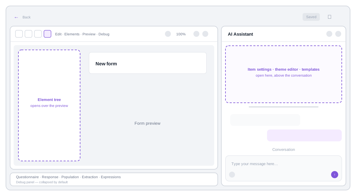
The page is split into two columns, 60% form preview and 40% chat by default. Drag the divider between them to change the split; the split resets on reload.
- Form preview (left). The live form, exactly as the renderer shows it. Above it sits the canvas toolbar; below it, the collapsed debug panel.
- Chat (right). The conversation with the assistant and the message input. Panels — item settings, theme editor, extraction template designer — open in this column above the conversation.
Everything that opens on top of the preview (the element tree, the translation table, the full-screen preview) is an overlay: the form is never reloaded when you open or close them.
Page toolbar
The bar across the top of the page carries only what applies to the form as a whole:
| Control | What it does |
|---|---|
| ← | Leaves the builder and returns to the form list. Hidden when the embedder hides the back button. |
| Save | Saves the questionnaire. Autosave works exactly as in the standard layout. |
| … | Preview, Publish, Load, Translation, Settings. |
Canvas toolbar
The bar directly above the form preview carries the editing controls:
| Control | What it does |
|---|---|
| Edit | Turns select mode on and off. |
| Elements | Opens the element tree over the preview. |
| Preview | Shows the form full screen, the way the person filling it sees it. |
| Debug | Expands and collapses the debug panel. |
| Theme | Picks a theme, or opens the theme editor in the chat column. Only for the native renderer. |
| Renderer | Chooses the renderer used for the preview. |
| Width | Form width: mobile, tablet, laptop, full width, or a custom value such as 900px or 80%. |
| Undo / Redo | The shared undo stack — it covers your own edits and the assistant's alike. |
Select mode
The preview has two modes, switched by the Edit button:
- Interact (default) — the form is live. You can fill it in and test it, as in any preview.
- Select — clicking anywhere in the form selects the item under the cursor and opens its settings in the chat column. Data entry is blocked while the mode is on, so a click on a radio button selects the question instead of answering it. The item under the cursor is outlined.
The selection is shared across the whole page: whatever you pick in the preview is highlighted in the element tree and shown in the settings panel, and the other way round.
Select mode is never restored after a reload — the page always comes back in interact mode.
Select mode needs the built-in renderer. A custom renderer in the preview will not report clicks back to the builder.
Panels in the chat column
Item settings, the theme editor and the extraction template designer share the chat column. They open above the conversation rather than over it: the message input always stays visible, so you can keep talking to the assistant while a panel is open. Drag the handle under a panel to change how it and the conversation share the column.
Only one of these panels is on screen at a time, and they stack: opening the theme editor while item settings are open hides the settings, and closing the editor brings them back. Closing the last panel leaves the conversation alone in the column.
Item and form settings
Selecting an item — in the preview in select mode, or in the element tree — opens its settings. With nothing selected, the panel shows the settings of the form itself.
The panel header also carries the two actions that apply to the selected item:
- Duplicate — copies the item next to itself.
- Delete — removes the item, after a confirmation.
Structural changes — moving an item, nesting it, reordering a group — are done in the element tree or by asking the assistant. There is no drag and drop in the preview.
A settings panel stays open until you close it with ✕, select something else, or ask the assistant to close it. Sending a message does not close it.
When the assistant adds or changes an item, it selects it so you can see what it did, but it does not cover the conversation with a settings panel. Only a selection you make yourself opens settings.
Element tree
The tree of form items is hidden by default. Elements in the canvas toolbar opens it as a drawer over the left side of the preview; pressing Elements again, or clicking outside the drawer, closes it.
Inside it is the same outline as in the standard layout, with the same search, drag and drop, and add and remove actions. Clicking the form title at the top of the tree opens the form settings; clicking it again puts the conversation back.
Debug panel
The debug panel sits under the form preview, collapsed. Debug expands it; its height can be dragged and — unlike the rest of the page state — is remembered between sessions.
The tabs are the same as in the standard layout: the Questionnaire resource, the QuestionnaireResponse, population, extraction and named expressions.
Translation table
Translation in the … menu opens the translation table over the preview. If the form has no language set yet, the panel asks for it first — translations are stored next to the source text and need the form's own language as their point of reference.
Opening the table rebuilds it from the current form, so rows the assistant has just written appear in it. Closing it pushes the edited strings back into the preview.
Letting the assistant drive the interface
In this layout the assistant can open and close the builder's own panels, which makes "where do I set this?" a question it can answer by showing you:
| You say | What happens |
|---|---|
| "Where do I set the form status?" | The assistant opens the form settings and names the field. |
| "Show me the settings of the weight question." | The assistant selects the item and opens its settings. |
| "Open the list of themes." | The theme picker opens. |
| "Show me the extraction tab." | The debug panel opens on the extraction tab. |
| "Close the panels." | Everything open is closed and the conversation is back alone in the column. |
| "Show me the form the way a patient sees it." | The full-screen preview opens. |
Opening a panel changes nothing in the form — the assistant edits through its normal tools and only uses the interface to show you things.
Task list
While the assistant works through a multi-step request, it keeps a task list above the message input. Collapsed it shows the current task and the progress count; click it to see the whole list.
What the layout does not keep
After a page reload the layout always comes back in a clean state: interact mode, element tree closed, no panel in the chat column, columns back to 60/40. The debug panel is the one exception — its height is remembered.
This is deliberate: a restored Edit mode reads as "the form stopped accepting input", and half the panels silently open reads as "my settings moved". Nothing about the form itself is affected — the questionnaire, the undo stack and the chat history survive a reload as they do in the standard layout.
Limitations
- Desktop only. There is no tablet or phone variant of this layout.
- No drag and drop in the form preview — structural edits happen in the element tree.
- Select mode works with the built-in renderer only.